DataRobot

Date: 2015-2017

The Overview

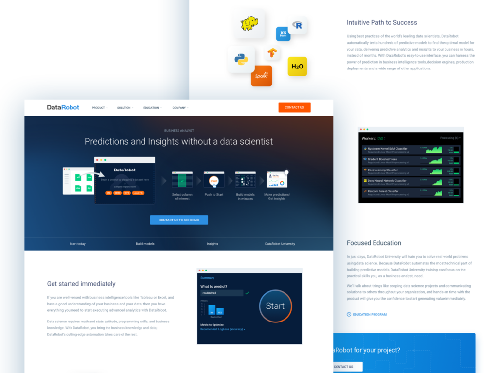
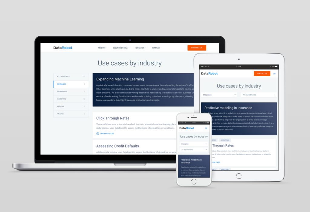
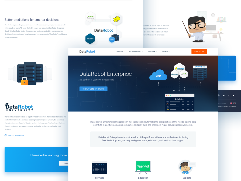
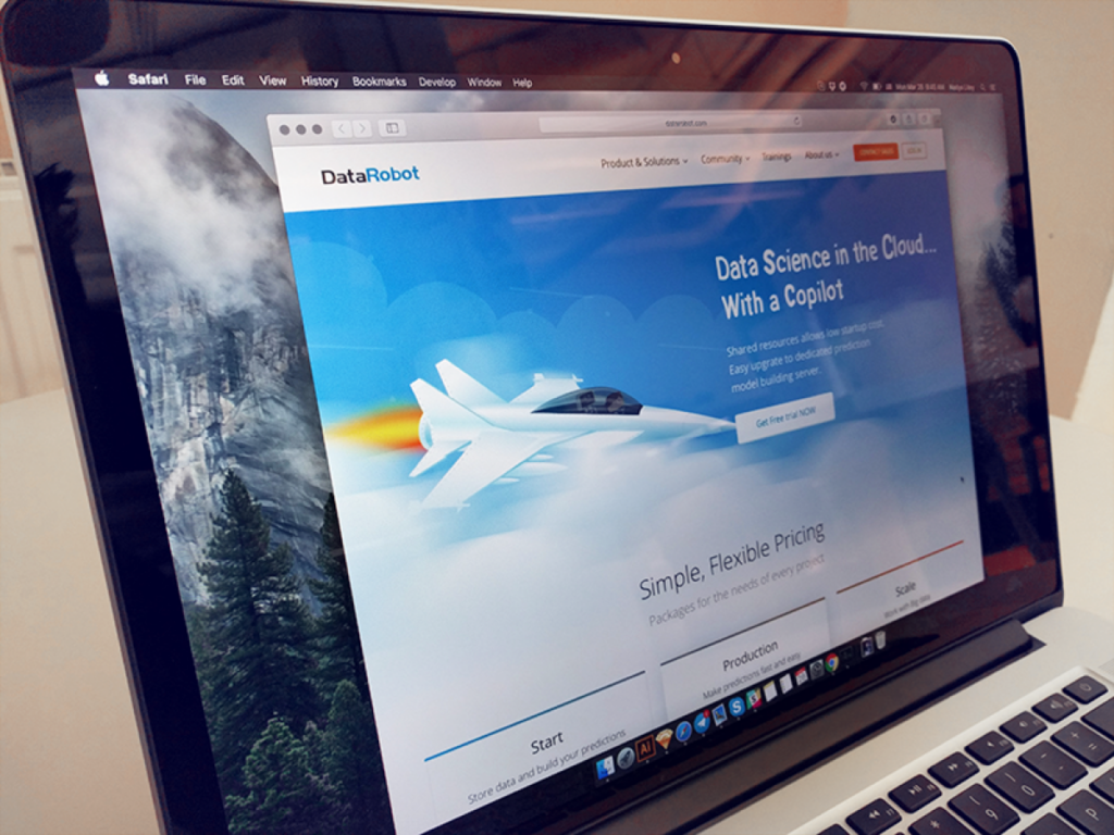
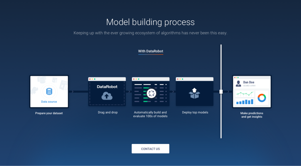
DataRobot is a data science and machine learning company. DataRobot provides users of all skill levels a platform to build and deploy accurate predictive models in a fraction of time, compared to conventional tools and methods.

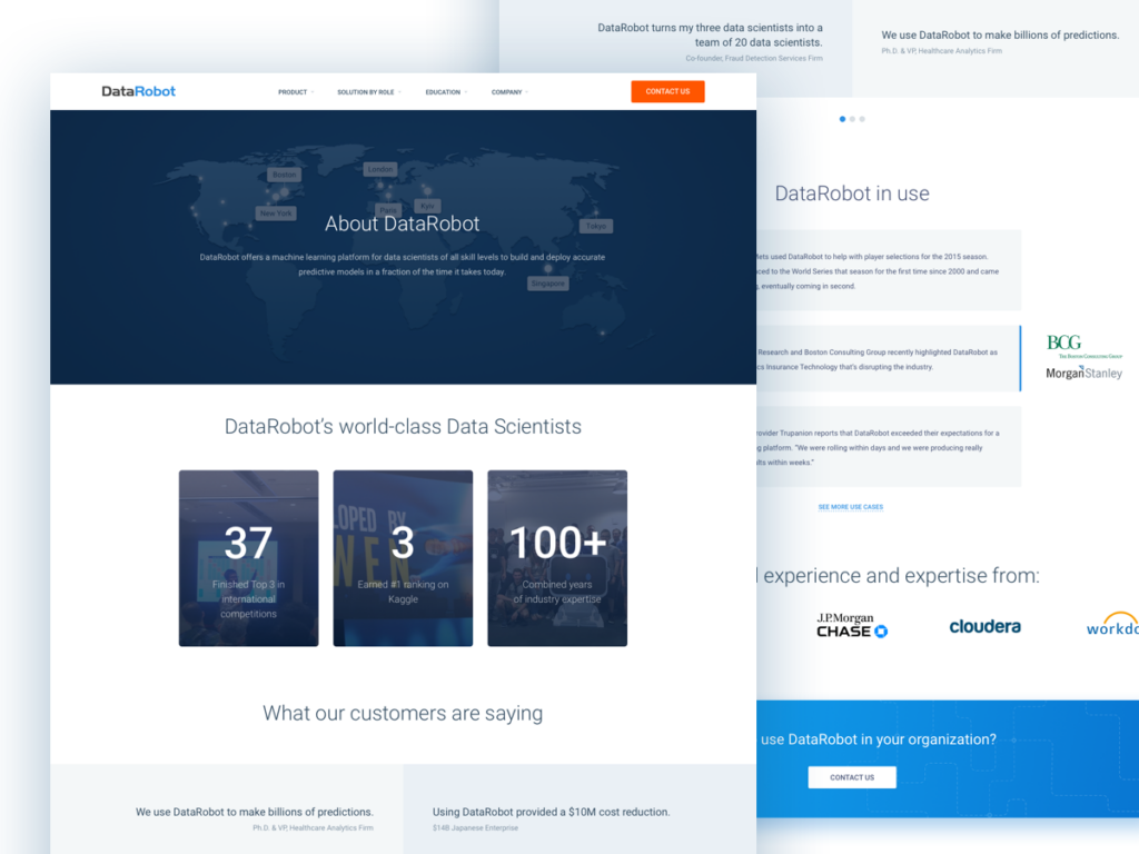
The company was founded in 2012, Boston, MA. The company is managed by top engineers and data scientists and backed by top-tier investors: NEA, Atlas Ventures, IA Ventures, TechStars, strategic angels.

Why I Was Hired

The look and feel of DataRobot’s website and branding materials were outdated. The company needed a new, professional, consistent, and distinctive look to show off the world, attract new big business across the whole world, raise awareness of what machine learning platform is and how people and businesses can benefit from using it.

My Role — Visual Designer

Let us first agree on what Visual Designer means.

So, basically,’ Visual Designer’ means Graphic Designer + User Interface Designer + Illustrator. Yeah, that’s simple.

My Responsibilities

  • Design Researches
  • Brand Guidelines
  • Branding/Marketing Materials
  • Wireframes & Prototypes
  • UI Kits & Pattern Libraries
  • Responsive Web Design
  • Illustrations For All Purposes
  • Other Supplemental Graphic Stuff.

My Integration

There’re at least two ways I can be integrated into companies workflow or design workflow, name it:

  1. I’m the only designer in a company.
  2. I’m a part of a design team working with other designers.

With DataRobot, it’s #2:

I worked closely with a Marketing Director from Boston, a Product Designer, a UI Designer, and a Web Developer from Kyiv.

Brand Guidelines

The guidelines were created to make DataRobot’s look consistent, professional, and distinct.
The ‘brand’ is more than just a logo, blah-blah-blah, let’s better have a look at how it looks in real life.

Logo

The logo is made up of two elements: the symbol and the logotype. We use the same version in print and on-screen. It’s simple. Easy to understand. No drop shadows, no glossy reflections, no flashy graphic effects.

Colors

The core colors give DataRobot personality — each color for each action on screen and in print.

Web Design

We created a bunch of page variations for different purposes for desktop and mobile. We started with the UI style guide to keep the consistency.

Illustrations

To create better communication, we came up with different illustrations that can easily simplify a complex idea. We use illustrations for different reasons: main screen banners, empty/zero states, on-boarding, announcements, print materials. DataRobot has six primary personas: Beginner, Business Analyst, Executive, Software Engineer, IT Professional, Expert Data Scientist.

Company-wide Universal Slides Kit

For internal and external usage was created Presentation Slide Style Guide in Google Slides.

DevOpsDays

DevOpsDays is a worldwide series of technical conferences covering software development topics, IT infrastructure operations, and the intersection between them.
We created two logos with the RataRobot mascot for Singapore and Berlin.

Kyiv and Minsk DevOps Days

Also, we had the DevOps Day event in Kyiv and Minsk with our logo, stickers, and other stuff.

Partnership Certification Stickers

We created unique stickers for our partners that have DataRobot Certificate.

The Most WOW’s Co-worker

One of the glassy DataRobot-dudes was given to a monthly ‘WOW’ co-worker.

Core Values Badges and Posters

To capture our Core Values, we created these badges that can be used in print and on-screen. Also, we created colorful and motivational posters with DataRobot Core Values that were posted all over our offices.

Core Values Posters

We created colorful and motivational posters with DataRobot Core Values that were posted all over our offices.

DataRobot Regatta

We had a summer Regatta with a unique logo and t-shirts.

Thanks for scrolling through.

Check Out My Next Project